Thursday, 6 February 2014

Life Book Week 6 Spray Inks

This weeks lesson was by Tam and focused on using spray inks such as Dylusions. I decided to make my own inks using pigment ink crystals and water and they seem to have given me a similar result. I wanted to create hair with stars and while Tam used a stencil for her flowery hair, I decided to use stamps that I'd made. I tried to graduate the colour from the vivid ink to a muted softer shade using chalks. I wanted my face to look skywards and spent some time thinking about feature placement and the angle of the neck. I do seem to be getting better at this...
As usual the camera doesnt do justice to the colours or pick up the glimmers of the mica paint I used in the hair.

Note to self.... Seal chalk with fixative before drawing over as managed to smudge lead and chalk all over the face!


Tam gave us a composition warm up to get use to the ink qualities and to learn about the rule of thirds and hot spots for placing key features. Especially loved the Autumnal colours as they reminded me of beautiful leaves.

Monday, 3 February 2014

Life Book Week 5 Candy Diva Marieks Blokland.

This was such a fun project! The features of the basic head were exaggerated and completely none proportional. I went for a liquorice wheel hair do with a Candy floss top knot. The background was particularly inspiring with many layeers of medium and paint. This was my first experience with black gesso and I loved the almost chalkboard texture that it gave me to begin with. She is simply funky...
My Candy Diva

Life Book Week 4 Kelly Hoernig

                                                                For Life Book's week 4 , we had to create a multi layered journal page using three of our favourite things; I chose driftwood, shells and a mermaid. I especially liked using scrim like a net under the faux wood, which was made by distressing a piece of thick textured paper. The shells came from Portugal and I dotted the piece with pearl beads. The larger quote was by Anais Nin. Everyone who did this exercise, couldnt believe how much 'stuff' was got out and the mess we made.
Week 4 Ocean

Saturday, 1 February 2014

Prismacolour pencil crayons with Suzi Blu

This is my first attempt at a Suzi Blu face, shaded using Prismacolour. The exercise is from Mixed Media Alchemy, Workshop1 Gypsy Girl. The crayons are quite waxy and unlike anything I've worked with before in that they blend using colourless or the white crayon. The head is created on photocopier paper and then cut out and stuck to a canvas board background, before the hair and backdrop are created with paint and spray inks.


Shading finished.

Shading begins....


Sunday, 26 January 2014

Lulu Art Experimenting with Promarkers

Background created with stamps and promarkers; the latter blended with an alcohol pen. Graphics from the Graphics fairy, printed and then coloured. Watermarks made with hand sanitizer. Wasn't sure but photographs quite well. Now can appreciate the contrast between the modern background and the vintage lady. I am going to work hard at masterring my pens.

Off at a Tangent (Again)

In Life Book Cafe, noticed a series of weekly free tutorials called Wildly Inspired by Effy Wild and thought I would have a go. I especially love the use of vintage photos and the old style drama and glamour, There is a dark almost gothic feel...  I used lace tape for the border and
Bohemian
antiqued with metallic gold Liberon. What a brilliant dancing outfit. Believe she was a Parisian showgirl.

The second exercise was titled ' Staying Wild'  I used my own photo as the Isadora Duncan one used by Effy was very blurred. Made a mess of my first attempt by using Sakura glaze pen which was very runny and bled. Loved the drippy background to this and the fine silver flecks.
Wild Heart


Life Book Week 3 Carla Sonheim

I have previously completed Carla's Faces class and am familiar with her creativity exercises. Drawing blind, wronghanded and doodling around blobs just doesnt do it for me! But... I did enjoy the found poetry exercise - rearranging a paragraph of prose and the collage and doodled flowers. Making the storage envelope was fun. A layer of chalk pastel, an impasto layer of gesso and then a watercolour wash over the top. As Alexander threw himself into the textured wet gesso I had to include him! Can you spot him peeping out from the shrubbery?
This is a piece created after a Jodi Ohl 'Let's Face It' class. I began by drawing in the basic features using Payne's grey and a large brush. It took me right out of my comfort zone but taught me to give everything a go. Lots and lots of layers later I was pleased with the almost spectral effect. Quote from Peter Pan.

Life Book Week 2 with Micki Wilde

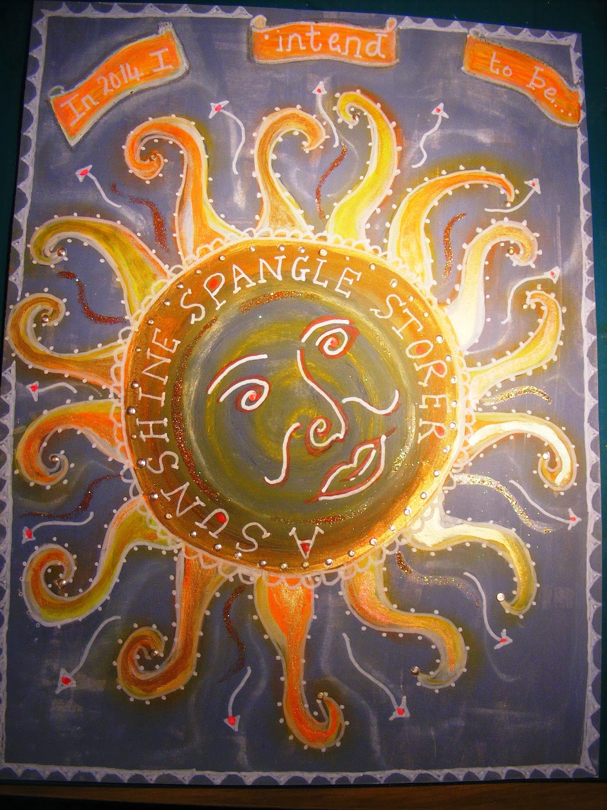
The exercise for this week was to create an Affirmation page using a grey background and neon acrylic. Lots of lifebookers felt uninspired by the colour choices but I'd worked with grey before in a Jodi Ohl class and felt unafraid. I love the moment when sunlight hits water and explodes into shimmering spangles. As we had to think up alternative job titles (and I could think of a few!) I decided on this as a metaphor for bottling up happiness and joy; to be kept for dark days. I so enjoyed using my white Posca pen which REALLY does write over everything, my glitter from Cathy which I keep stroking (30 shades YUM!) and perfect pearls paint. This was such fun!

And point your toes....

My mum.....
I began to think about how much my mum would have loved Life Book. I forget how arty she was and have very early memories of her sitting and painting with me or making toys and dolls clothes.
I decided to dig out an old photo and have a go at a portrait. I always seem to picture her getting ready for parties in floaty 60's trapeze dresses in peach or sugar pink. She had lots of hair pieces and always looked glamorous. And oh how she loved to dance. There was always music in our house....
I had to include 5,6,7,8 as she counted us in and her favourite groan 'point your toes!' I had all the grace of a baby elephant.


Monday, 6 January 2014

Life Book Week 1 Guardian Angel

During my meditation which I managed on the third attempt, (The silence was twice interrupted -once by the cat scratching to come in and once by the cough monster, but I found my fairy lights and a glass of Baileys) my word HOPE came very quickly. There are those close to me who are ill and I want them to get better more than anything.... I find it easy to visualize and the path lead to a hall with a vaulted ceiling painted with angels as in one of my favourite pictures, Night with her Train of Stars. This is a huge piece which I always look at when in Birmingham. It is simply beautiful.
My angel had an aura of irridescent jade like the sea in St Ives on a sunny day. Her eyes were closed in contemplation as she prayed and looked heavenward.
I can not begin to describe how much I loved drawing and painting her. I can see how much I've learnt since I started drawing faces again. Still masses to learn and refine but my confidence is growing.

Julie this one is literally for you. I could feel your inspiration as I painted it.


Friday, 3 January 2014

I am so excited to have joined Tamara Laporte's Lifebook 2014 this year and hope to chronicle my progress here. Thank you Tom and Cathy for such a wonderful Christmas gift. Alexander has purple paws already!
First exercise was a warm up using neocolours, acrylic and metallic oil pastels Yet again I was drawn to my palette of bubble colours..... I was pleased with the effect but disappointed that the shimmer of pearlescent  acrylics and my new glitter doesnt show up on the photograph.
Really need to work on my writing. I want it to look spidery and artistic but it still looks like teacher print!

Tuesday, 6 August 2013

One of the absolute joys of The Diary of Faces course is the art history opportunities to discover new artists. I am blown away by so much that I have found.... I have put into my Pinterest enough inspiration to keep me painting until I'm 200!
Grigorescu was prolific and I was interested to discover that like Chen, he studied in Paris and was a contemporary of Millet and Corot. Much of his work is quite dark and brooding but I found several that I wanted to attempt too.
My sketch
I left this one as a sketch as I liked the different tonal values.
The background on the painted version was very gloomy and the hair tended to get lost. I looked at some tips about moulding the hair around the head and took longer to layer my pencil strokes and can see a small improvement.
In the original she has an almost secret half smile and I think I've captured that?. The eyes are slightly different sizes in retrospect and the left one needs moving over a fraction.

Grigorescu Head of a Girl
My favourite painting is entitled 'A flower amongst flowers -Miss Millet. It is so pretty and light. I took a photo of the undersketch before I painted it. As I will be applying sheer paint layers to shade, it is really more of an outline,laying down, hopefully proportionately, the main features. I think in the original she is possibly lying down in a meadow and I found it difficult to give that impression.
My undersketch of Miss Millet


I was interested to discover that Grigorescu was in love with Millet's daughter but it 'didn't result in a happy conclusion'. I havent yet found out exactly why?
She's certainly gazing at him in adoring bliss....
Whilst I think I captured the delicacy of her features I like the soft focus feel of the original. I am puzzled as to why her forehead looks so white as it doesnt on the actual painting. A light trick?
Detail Miss Millet
I
                                                                                  

Nicolae Grigorescue

This was the week two focus for Sharon Tomlinson's lessons. Initially I wasn't especially inspired by the choice of portrait. It is extremely dark and difficult to work out the placement of the headscarf etc.I'm not keen on how the right eye is obscured and it is too impressionistic for my tastes.
Grigorescu Girl in Scarf

But I had a go....... I sketched it first and actually learnt alot from the process. The nose is relatively short , the face and lips full, giving it a youthful feel.
I used artistic licence with the headscarf and the eye! I drew a type of hajib I've seen some of my younger pupils wearing that is easy for them to put on. I think this portrait has good contrasting tones and was more pleased with it than I expected to be!
Grigorescu inspired sketch

I think she appears grumpy rather than pensive.....

I tried to stay with Sharon T's Acrylic version, making myself put away my other mediums as I need to develop my ability to apply glazes and work this way. I produced a
painting of which I was really proud, trying to make more of a scarf but failing miserably with cloth folds!
I liked the head tilt and the features and was pleased with the muted tones chosen, although not as dark and abstract as the original.
My girl in a headscarf

More Asiatic faces

Delicate Japanese girl


I didnt quite capture the almond eyes in this one but was happy with the titlt of the head. I was drawn to the delicacy of the features and contrast between the porcelain skin, red lips and black hair. The latter again needs much more practice.

I chose Yamaoka's work as a contrast- she has such a strong and striking face. I was amazed to read that he produces these works using an art software on a tablet. I'd be interested to try.....
Inspired by Seiko Yamaoka portrait
I've been busy honing my portrait drawing and painting skills and find myself attempting to replicate faces I wouldn't have even dared or known where to start. Georgette Chen's work led to a fascination with Asiatic features, the obvious almond shaped eyes, porcelain skin and distinct bone structure. I liked the following work of Chen's and copied it using Neocolour II's.
Georgette Chen's portrait of a young woman


My mixed media version
I was pleased with the shape of the eyes and face. The colours are obviously brighter but then the medium used was different to that of the original.

I looked at many different Asian portraits during my research and chose a few to try to draw. I liked this Malaysian beauty with her huge eyes and pouty mouth, deciding to leave it as a pencil sketch. I love the way she is looking skywards and has a dreamy expression. I need to do alot of work with recreating hair in pencil!
Malaysian girl pencil sketch

Monday, 15 July 2013

Diary of faces Georgette Chen

I've developed a real desire to become better at creating faces and found Sharon Tomlinson's online course 'A Diary of Faces', which gives detailed tutorials in producing realistic portraits. Using examples from artists, she examines how they create faces, teaching how to draw profiles, 3/4 views etc, as well as how to shade and layer paint and medium. Its more technical than some classes I've viewed and seems to suit where I'm at with my art.
Research is an element of each project and has given me a good excuse to brush up my art history! The first brief was to study Georgette Chen, (  1906-1993) a painter from Singapore, who broke the mould by becoming one of the first acknowledged female Asian artists.
This is the original I worked from:   


The eyes had very distinctive iris shapes and the nose presented its own challenges.I found the coiled hair quite tricky too. I followed the recommended palette but in retrospect probably should have made my own choices as I found the greenish tinge in the underpainting a little overwhelming. I still find working from dark to light counter intuitive after using watercolours!
I enjoyed finding out about other Chinese painters and discovered some great art in the process. Contemporary artist He Jia Ying and Pan Yuliang were two of my favourites.


The painting I've done has more depth than this photo suggests.
It appears here looking alot more washed out. I think I captured the steady gaze but the left eye begins too far from the bridge of the nose. I need to remember to photograph my sketches, so that I can
work further revisions from them.

Thursday, 11 July 2013

This was my own composition as part of a journal page entitled Summer. I used the techniques learnt in Christina's tutorial but exaggerated the eyes and made the face longer and more chiselled.
I think the face is a little more contoured? I  wanted to create a goddess 'feel' in celebration of the Solstice and decided to give her a wreath of ferns, clover leaves and tiny daisies. I painted in a background halo shaped wash in 3 different greens and then over- stamped with leaf motifs. The daisies were painted in with white acrylic.
Again I used Neocolour watercolour crayons for the skin and facial features. The hair was coloured with Stabilo carbothello pastels and highlighted with Luminarte H20s. I was especially pleased with the violet wash I used under the skin tones and around the eyes and through the hair. An unusual choice but it worked giving her an ethereal glow.
What would I improve? The left eye is slightly larger! I loved doing this and am so inspired to practice further......

Tuesday, 9 July 2013

Learning to Draw

I've gone off at another tangent and have developed a yearning to improve my drawing skills. I have been playing around with Carla Sonheims 101 faces but to be truthful am not happy with button type eyes. I want
to be able to create bone structure using shading and eventually produce more of a likeness..... I spotted this free tutorial by Christina Zinnia on You Tube and thought I'd have a go.

I used a 3B and a 6B pencil to produce this; a torchon to blend and a kneadable eraser to add highlights. In retrospect, the face is a little wide and they eyes a touch to wide apart, but for a first effort not too bad. I was a little nervous about colouring it so preserved the sketch with a photograph.


I used Neocolour water soluble crayons and Aquarelle pencils to
finish my piece. The hair is a bit stripy but I'm pleased with the skin tones.

Sunday, 7 July 2013

Sparkle

My art seems to have taken a back seat this week, as Ive spent a disproportionate amount of time rescuing my Birman cross Alexander, from trees, dogs, insects and the heat! Most of the projects involved lots of materials and he always seems to appear as the glue,glitter and paint come out. He seems especially fond of
licking irridescent ink!
My first piece involved creating a watercolour background using a wet on wet technique and then collaging a central flower using tissue paper. This was painted with metallic acrylic giving it a textural effect.

Dion Dior used stencil leaves and flowers for her backgrounds but I haven't got many, so I combined
them with stamps. I particularly likes the butterflys.
I added bubble wrap printed gesso areas for extra
interest and subtle accents of glitter glue.

I was pleased with the delicate colour scheme and composition which was shimmery but not gaudy.


Dion Dior continued to work over the above piece
adding several mixed media layers, acrylic 'frames', an all over stencilled pattern, transfer foil and tiny gems. I also added stamps of seed heads to give the composition a less blocky feel. The oranges, reds, golds and olives were chosen deliberately to move me away from my default 'bubble' or 'ocean' colours. I wasnt sure I liked this piece the whole time I was working at, finding it too abstract for my taste. Finally I grew to enjoy it as in the flesh it has alot of tones,texture and depth.
The next project was a spiders web and a return to a more delicate way of working with H2O's and Cosmic Shimmers. Again a wet on wet background, to create green foliage and impressionistic flowers. These were outlined with water colour pencils and highlighted with metallic acrylics. Salt sprinkled on the washed background had also added texture. The web spokes were bleached out using discharge paste but I didnt find this worked too well as it began to corrode the paper.
Finally the web was defined in glitter glue. I have a limited selection of this and would have liked to create finer lines.